FLOCK
Flock is an art gallery and conservation organization based in Tiburon. It was founded by artist and entrepreneur Robert Stevenson.
STRATEGY + BRANDING + WEBSITE DESIGN
THE CHALLENGE
Robert was looking for a logo and brand identity to reflect his vision for Flock. He wanted Flock to appeal to three types of people: People who are aware of birds and casually enjoy watching them, people who love birding, and people who don’t know yet that they love birding.
At the beginning of the project, we spoke about his short term and future goals for the brand.
DISCOVERY
To get to the heart of Flock, I asked many questions about the problem Robert was setting out to solve and why. Ever since his first birding experience, he has been hooked. It re-connected him with nature, and he loved the way it made him feel: in awe, present, mindful, and both calm yet energized.
He started taking photos of birds and painting them as a personal creative project. As he learned more about birds and the dangers of climate change, he realized that art could be a powerful way to spread awareness about conserving wild places on Earth.
Robert's story provided a foundation to begin building the brand. I discovered what key attributes the identity needed to convey and began designing a brand that reflected the unique characteristics and values of the organization. Flock's brand is bold yet calm, authoritative yet inviting, and authentic.
EARLY CONCEPTS
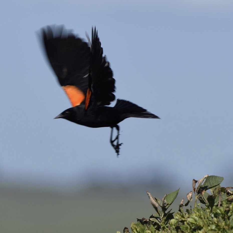
The first time Robert went birding with his friend Adam, he spotted a bird with shocking red shoulders and a unique flight style. Despite it being a common bird in Northern California, he had never noticed it, even after 20 years of living in the area. From that day on, he started noticing this bird everywhere. He couldn’t unsee it.
The Red Winged Blackbird represents Flock’s mission to share the invisible world and to open people's eyes to the often overlooked beauty around us.
We wanted to incorporate some of Robert's original artwork into the logo, so he illustrated a photograph (right) that he took of the Red Winged Blackbird on the computer. Once the illustration was refined, I experimented with typefaces and created several different high-fidelity logo concepts. I chose to pair the graphic with a classic typeface to round out the brand to be timeless with a modern twist.
FINAL LOGO
Overall, the primary and secondary logos authentically convey key brand attributes: bold, authoritative, and inspired, with a nod to Robert's artwork and personal style.
The secondary logo allows flexibility and can be used for applications where there is less space and a more condensed version or a reduced size is required.
GALLERY EXPERIENCE
We discussed what he hoped people would feel when walking through the art gallery and interacting with Flock branded materials. Through the process, we defined the brand voice and direction. I designed a suite of branded materials, including all signage outside the gallery and different components inside the gallery. I collaborated with an interior designer to bring the overall brand vibe throughout the physical store. We celebrated the store launch in June, but our work is far from over!


