
Revamping the tipping experience.
Instacart experienced massive growth during the pandemic, yet tips remained surprisingly low. By creating innovative, personalized tipping experiences, I redefined tipping and drove significant impact.
Product Designer on Shopper Experience team | June - Sept 2021
The core problem is that low-tipped orders are perceived by Instacart shoppers as not worth their time and disrespectful — necessitating the company to boost pay so they’re more appealing.
Opportunities
Guidance
How might we tailor the UX for specific order types or scenarios (e.g., large orders, bad weather)?
Empathy
How can we emphasize that the shopper is a real person putting in effort, encouraging generosity and appreciation?

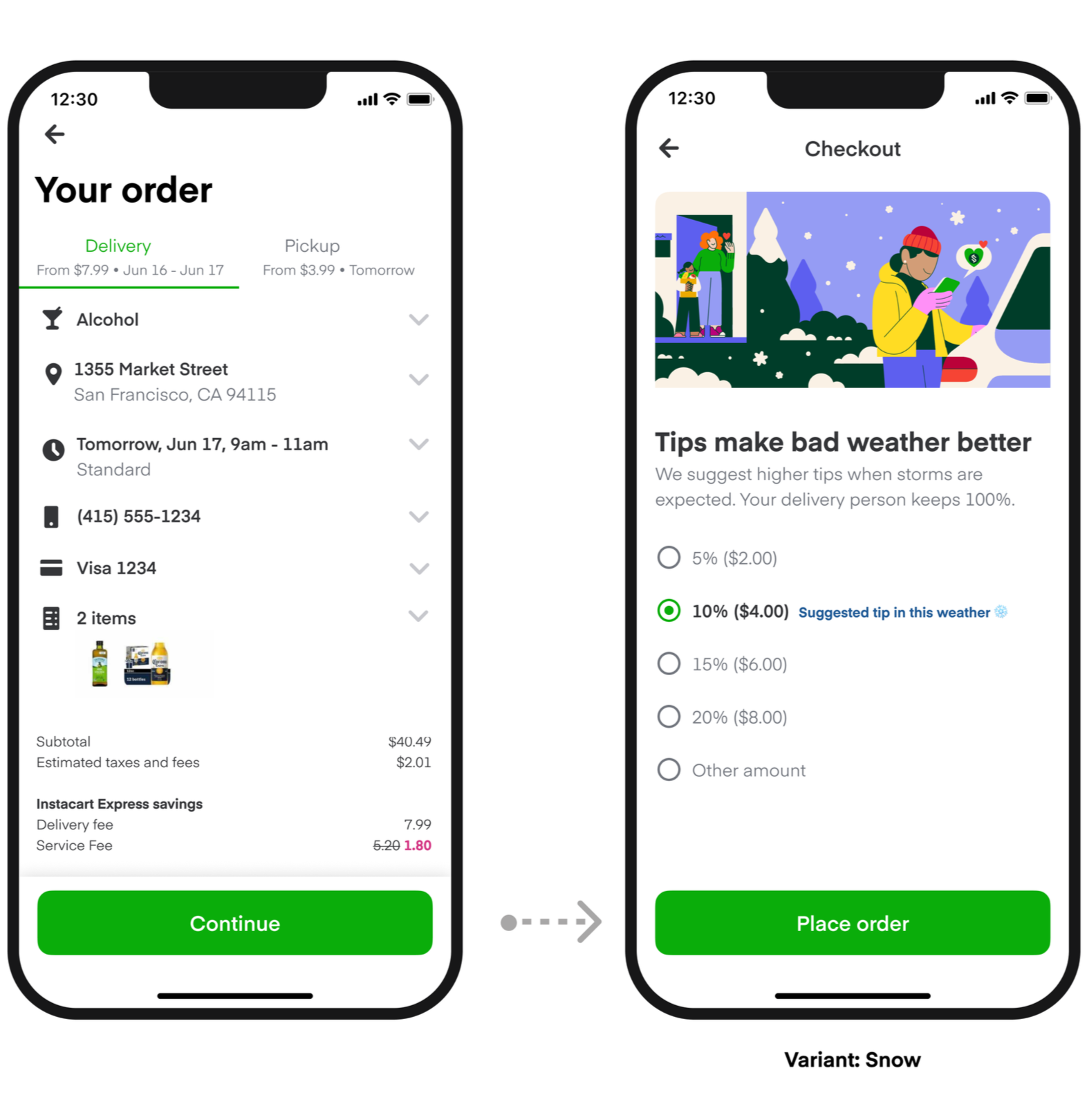
Introducing: Dynamic tipping experiences
Since many customers aren’t sure what a fair tip is, our strategy focused on introducing multiple ways at checkout to raise the overall tip percentage and reduce orders with low tips under 5%.
A new dedicated tipping step during checkout emphasizes the shopper’s effort to fulfill their order through thoughtful copy and an animated illustration. A weather-themed variant appears during rain or snow to create a more personalized experience.

Mobilizing shoppers during high demand moments
To balance supply and demand, I designed contextual experiences that encouraged shoppers to go online during high-demand periods—like rainy weather—by highlighting peak earning opportunities and higher tip potential. This motivated shoppers to deliver when they were needed most.

Introducing: Low tip mitigation
If a customer entered a $0 or low tip (less than 5% of the order total), we prompted them to reconsider the tip amount. We tested multiple content variants, and the most effective approach was highlighting that orders with tips are claimed by shoppers faster.
The new tipping framework led to increased earnings, and shoppers feeling much more appreciated.
✅ Significant increase in the overall tip percentage across orders
✅ Reduction in $0 and low tips, reducing Instacart’s cost to boost orders
✅ Mobilized shopper supply during high demand
✅ Increased shopper sentiment, with positive reactions in community feedback channels
Process preview
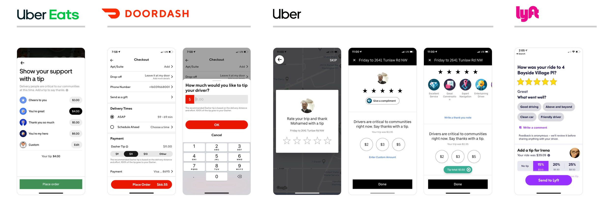
Competitive analysis
I reviewed tipping experiences across digital and real-world settings, along with research on tipping psychology and behavior. These insights informed a design approach focused on timing, placement, and defaults that feel considerate and intuitive.
I led a cross-functional brainstorm where we ideated solutions.
How might we effectively guide customers to an appropriate tip amount?
How might we use social proof and leverage data?
How might we inspire higher tipping contextually?
My PM and I synthesized the ideas and prioritized themes, and then I developed high-level concepts to validate through testing.

Focus
How can we help customers see tipping as separate from service fees?
Contextual
How might we prevent low or inappropriate tips at the moment customers enter them during checkout?

